

Looking at Illustration: Arthur Getz
I’ve been looking through the illustrations of Arthur Getz, one of my favorite New Yorker cover artists. Getz painted 213 covers for the iconic magazine between 1938 and 1988. In addition to illustration work, he painted cityscapes and landscapes – ‘fine art’ sold through galleries – although he sometimes signed them with his middle name, Kimmig, because at the time a fine artist was not supposed to cross the line into commercial art.
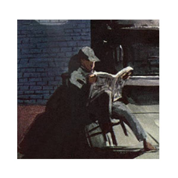
A particular favorite of mine is his cover from 1957:

Art by Arthur Getz. Prints available through https://condenaststore.com/art/arthur+getz
The moment it captures is utterly American, isn’t it? To the left, the bustling, spangly city with silhouetted crowds in frenetic motion, and in the foreground the relaxed parking attendant, contentedly oblivious to the high life a few blocks behind.
The skill and techniques of this artist make the painting especially appealing to me. The blazing city lights in the distance are warm, but it’s cold moonlight fluorescing down on the garage attendant – that’s the opposite of what you’re taught in painting class! Warm colors are supposed to come forward and cools recede – but Mr. Getz makes this inversion work beautifully. The covers of the magazine our fellow’s reading are slightly brightened with the reflected light bouncing off the pavement – reflected light is a detail that a master’s eye notes, and novices often overlook. The splashes of neon red far off in the city are balanced by that rusty red wall to our protagonist’s left; there’s even the faintest red haze in the air above the cars in the garage, a delicate touch to offset all that chill October air.
And our attendant’s pose, balancing on the chair – another master stroke. Students of life drawing know: when you draw a standing figure and you want it to look steady, not tipping over, you draw it so the supersternal notch – that’s the central notch between your left & right collarbone – is directly over the inner ankle of the leg bearing the weight of the body – this makes the figure looks solid. Well, Mr. Getz has this gent perfectly balanced: if you imagine where his supersternal notch is, and draw a line straight down, it’s directly over the spot where the chair leg bearing the man’s weight touches the pavement. This acrobatic bystander is not going to tip over!
The contrasts in tone all around our nonchalant hero seal the deal for me. After your eyes take in the whole scene, where does your attention go? To the crisp lightning-white page edges of that magazine and that tiny cusp of face and finger illuminated by the October moon. That’s intentional – they are painted with a razor edge and surrounded by blacks and neutral grays to draw your gaze like a pinpoint. The same goes for the swatch of city on the left, the contrast is so high between the yellows and blacks that you can’t not look at them – but even though those marks are skillful, they are vague, to give an impression of buildings and lights. The painting strokes in and around our parked friend’s figure, instead, are descriptive, deliberate and masterful.
There’s sometimes a bit of friction between illustrators and fine artists, over whether illustrations deserve the same esteem that framed paintings are given. If you ask me, this Garage Nocturne by Arthur Getz could hang in a museum next to Hopper’s Nighthawks any day. — Pat Achilles www.AchillesPortfolio.com

0 Comments